Facilitating referrals and drawing in more partners
Shipped
2025

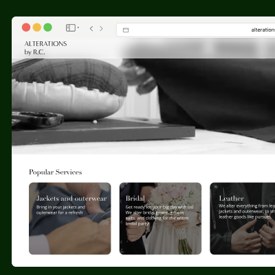
The Support Network, a non-profit providing caregivers with resources to better support children with behavioral and educational needs, reached out for a website refresh. However, after navigating the site, I noticed that the site needed more than an update. The directors at the organization had expressed the desire to have a website that facilitated intake processes, referral requests, and made resources more available to their clients. and It needed was in need of a new website.
Along with establishing a new visual identity for the website, I also improved the current referral request flow by taking it out of PDFs and into its own page, facilitating referral and intake processes. Navigating the website was a major pain point for users, so I created a new site architecture that increased findability.
Growth in referral requests: +30% engagement on the referral request page.
Uptick in site navigation: Contact Us and Meet our Team pages increase +26% and +12.%,respectively compared to the months prior to the redesign
More site visitors: Overall site views: +42% to 48% YoY (2.1K to 2.4K across the post-launch window)
[insert Design Audit graphics ]
The website had navigational issues. There were pages with repeated content and low contrast. I improved the navigation via an updated site architecture that prioritized resources and flows.
[insert new information architecture]
The referral request flow is an important part of the work the staff at The Support Network does. Through referrals, staff members connect parents to medical health professionals who can provide the best care and guidance for their child, sitting at the crux of the organization’s mission. Yet, the process of getting a referral and requesting additional service was tedious. Not only was the page to referrals buried in other pages, but also the process itself was dated, relying on printing out forms and sending items by mail. The tedious process held parents back and therefore limited the number of people who worked with the organization.
[insert current user flow for requesting a referral. Find the website (if you found the right one), click through resources, find referrals, find the document, print the document, fill it out, scan it, and send it to the coordinator.]
The Support Network is a common name for mental health-related organizations. The Support Network in Western Massachusetts was competing, in name, with organizations around the country. Therefore, it needed a different way of standing out. The current site, with its early 2000s layout, felt more like a blog post than a mental health site with resources. The website had low contrast on text and pages, but the real issue was making sure the site did not feel dated.
[insert graphics of new colors and visual styles]
The new colors helped identify The Support Network as a mental health-oriented organization and communicated that it was geared towards families.
The original website had page bloat, too many pages with repetitive content. My strategy was to reduce the number of pages by prioritizing valuable information and condensing repetitive content into a single page.
[insert old and new ia]
One of the underlying goals of the redesign was to facilitate referral requests. Although it was not on the brief, it was a common topic of discussion during meetings.
[insert new flow to request referrals]
The current process had too many steps, which discouraged busy parents. I made the process simpler by putting the entire form on a single page and redirecting answers to the coordinator’s inbox.
The website’s main problem was awareness. Current clients were having trouble finding the actual website and even more trouble finding what they needed when they arrived. Aside from updating the site architecture, I wanted to help situate the website within mental health. I updated the colors and images, but also updated copy, SEO, and metadata to align with searched words so that The Support Network would show up when clients searched for the organization.
[insert layout and color and copy]
[final screens]
Having had some experience working with clients, I learned that there is always more to a design project than is stated in the brief. As a result, I learned to ask questions early and be attentive to recurring themes and topics that show up in meetings. Doing so has helped me identify problems early in the design process.