A revitalized website to bring in more customers.
Shipped
2023

When Alterations by R.C. initially opened, there was a lot of buzz around the store. The traffic on the website was driving customers into the store. However, after a few weeks, the traffic died down.
The current website did not reflect the values or mission of the business. Additionally, the layout of the website made it difficult for customers to learn more about services and pricing offered by the business, therefore not installing trust in customers and potential deterring customers.
After the changes to the website, inshore attendance rose to 15%, bounce rate dropped by half and questions regarding pricing in the store’s inbox dropped completely.
There were many pain points on the homepage, but the primary issue was the site’s navigation.
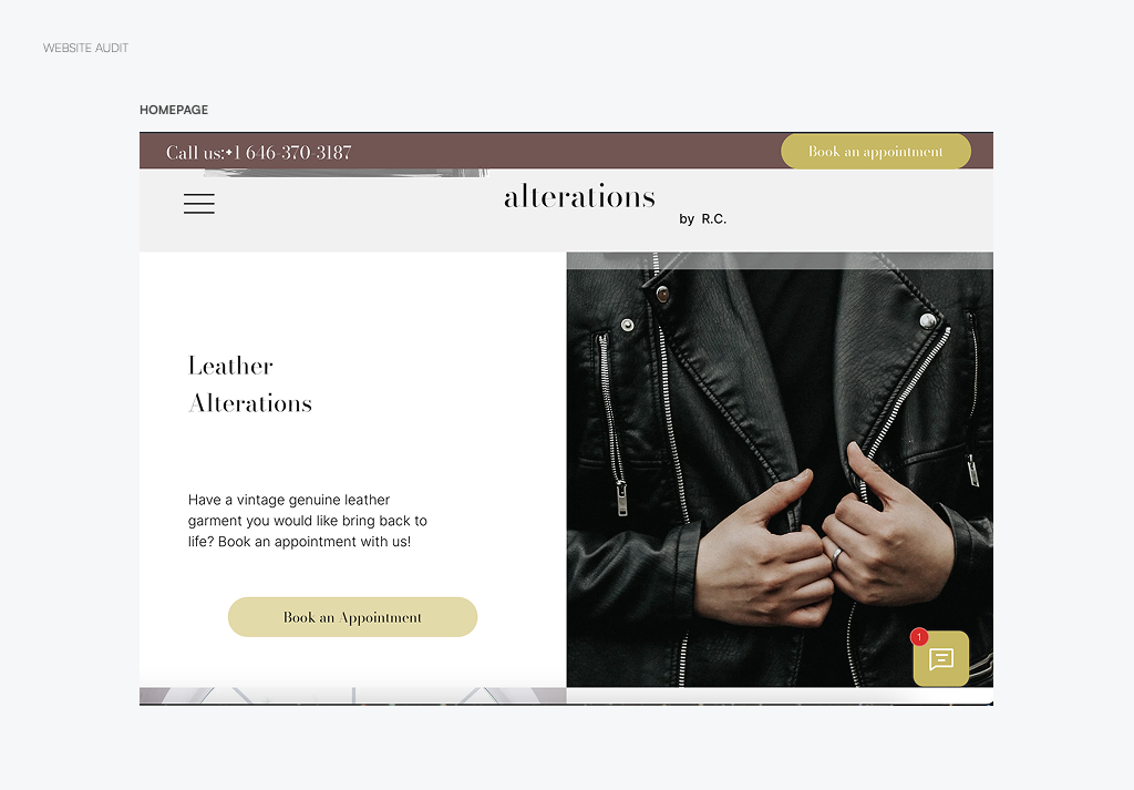
Hamburger menus are popular in mobile site designs, but many of the users searched for the business on desktop devices. Because the current site was not responsive to either breakpoints, customers were have issues navigating to other pages on the site, primarily the pricing page. The menu display issue created unnecessary user friction which ended up costing the business customers.
Bounce rates and messages notified me that many of the customers were not moving beyond the homepage because they were unable to find the other pages. Looking at the initial data, I assume that the site only had a discoverability issue, but a deeper look into the messages the small business received implied a findability issue as well.
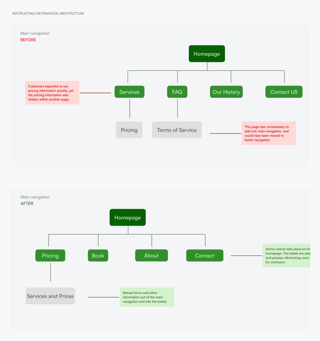
[insert graph of old information architecture along side screen shot of old website]
Swapping the hamburger menu for a horizontal bar menu allowed the users to navigate freely from one page to the next, allowing them access to more relevant information and removing doubt from their journey.
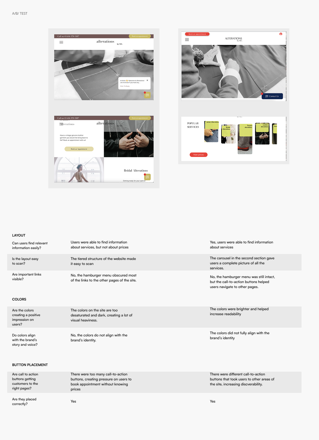
An A/B test demonstrated two key changes: 1. changing the color palette and tone of voice created more booking appointments and 2.moving popular services to the homepage instilled a sense of transparency towards the customers, which made them feel comfortable booking appointments.
Key Insight Customers were moved by an honest and friendly approach tone.
[insert visual identity preview]
The final layout, colors and microcopy worked together to create visual identity that would later serve as the foundation for the business’s brand identity.
[insert video of full website walk through]